my hand drawn words
my hand drawn words
Couldn't load pickup availability
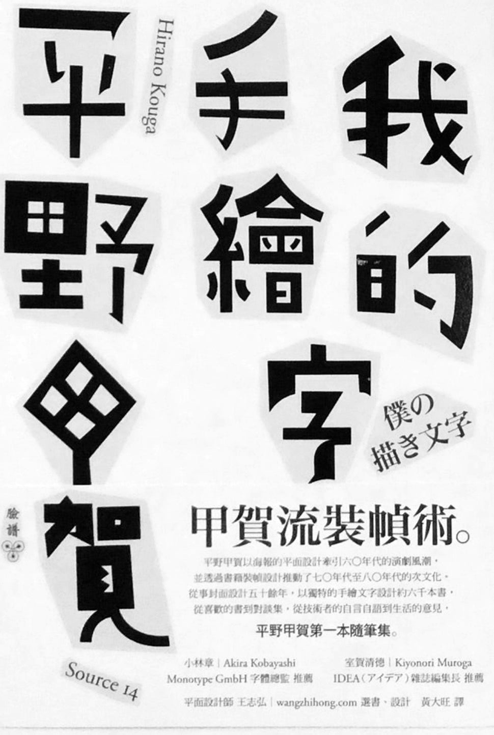
Synonymous with "hand-painted characters", the Koga-ryu binding technique that allows hand-drawn characters to dance naturally, he led the drama trend of the 1960s with the graphic design of posters and promoted Japanese subculture in the 1970s and 1980s through book binding design. Engaged in cover design For more than fifty years, he has designed nearly 6,000 books with unique hand-drawn text for the works of masters such as Oe Kenzaburo, Sawaki Kotaro, and Nakahira Takuma. From favorite books to dialogue collections, from the soliloquy of technicians Opinions on life, Koga Hirano's first collection of essays
A master of critical hand-drawn calligraphy who breathes life into words
Using unique lines to present hand-drawn text that is both simple and interesting, Hirano Koga, a graphic designer who has been dancing in the world of books since the 1960s, was born in 1938 in Beijing (now Seoul, South Korea) , graduated from the visual design department of Musashino Art School (now Musashino Art University). In 1960, when he was still studying at Musashino Art School, he designed a poster based on the novel "Jump First, Look Later" by literary master Kenzaburo Oe, and won the very important "Japan Art Promotion Association" exhibition selection award at that time. After graduation, he worked in the publicity department of Takashimaya Department Store and later worked as a freelance designer.
From 1964 to 1991, he designed and coordinated the covers and bindings of all Jingwenshe's books, establishing a unique corporate image for the publishing house. In 1983, he designed the cover for Kinoshita Junji's "Hongo" and won the 15th Kodansha Publishing Culture Award in the book design category. Hirano Koga has designed about 6,000 books with unique hand-drawn characters, and no one else has done it better. He has been commissioned to design the works of famous artists such as Jinichi Uekusa, Makoto Shiina, Jiro Ono, Shochi Imae, Takuma Nakahira, and Riku Onda. knife. At the same time, he also had extensive exchanges with "Black Tent Theater Company" and "Buffalo Band", and handled numerous graphic publications, posters and theater designs. In 2005, he served as the artistic director of the "theater iwato" small theater in Kagurazaka, Tokyo.
Some people think that he was influenced by the "oblique structure" of Russian formalism and developed a unique font style. When each font appears, it looks like a comic character with its hands and feet dancing!
Hirano Koga himself thinks——
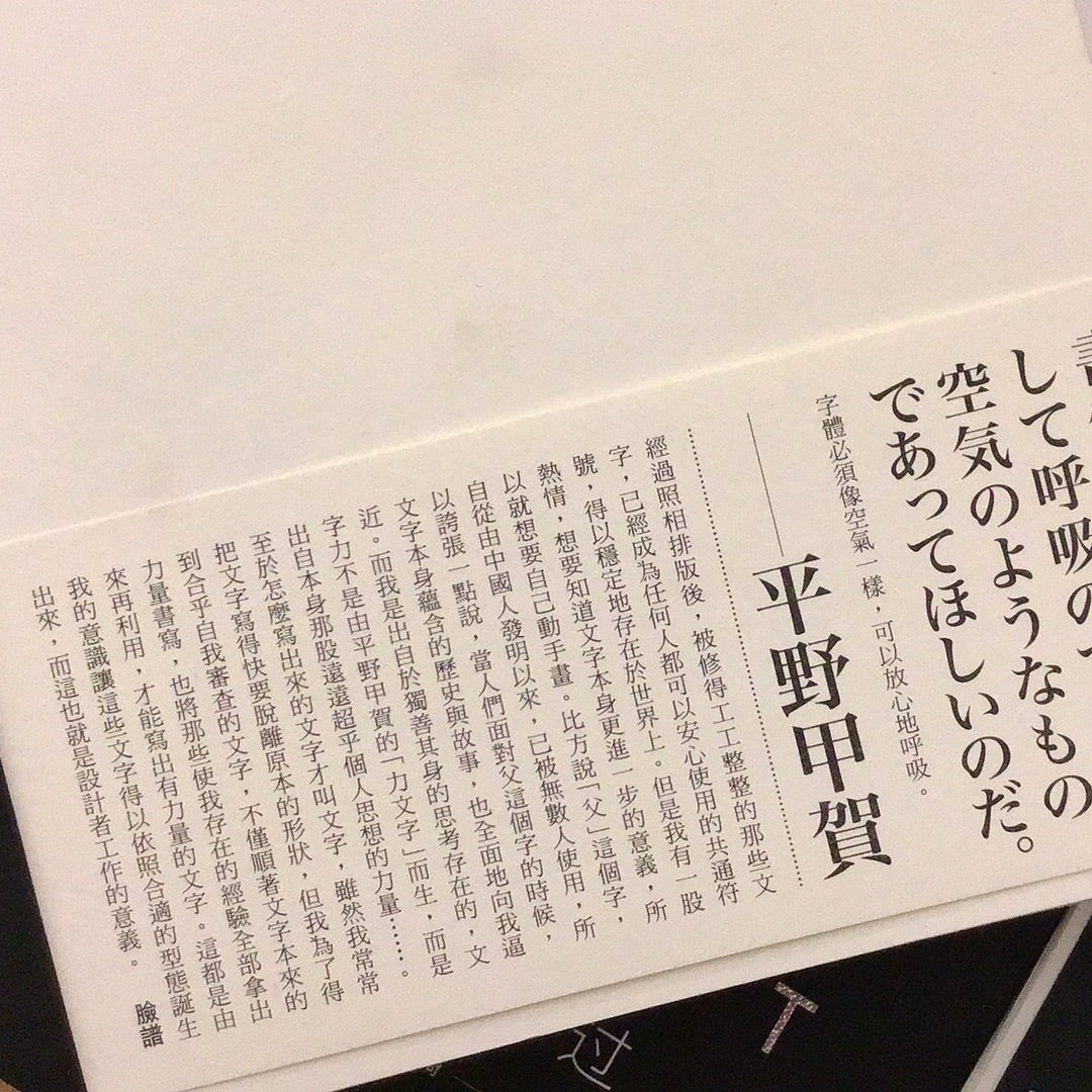
Fonts must be like air, something you can breathe with confidence.
"After taking photos and typesetting, the neatly trimmed words have become common symbols that anyone can use with peace of mind, and they can exist stably in the world. But I have a passion to know the further meaning of the words themselves. , so I wanted to draw it myself. For example, the word "father" has been used by countless people since it was invented by the Chinese. So to exaggerate, when people face the word "father", the history contained in the word itself and stories are also approaching me in an all-round way. And I am born out of a solitary thinking existence. The power of writing is not born from Hirano Koga's "power words", but from my own power that far exceeds personal thoughts. ….
As for how to write words, they are called words. Although I often write words that are almost out of their original shape, in order to obtain words that meet my self-examination, I not only write according to the original power of words, but also write the experiences that make me exist. Only by taking them all out and reusing them can you write powerful words. It is my consciousness that allows these words to be born according to the appropriate form, and this is the meaning of the designer's work. "
From a technical point of view, I really avoid perfection. Once I reach perfection, it means that I have no chance to sing. I want to write more sincere words and explore various possibilities of changing these words. Maybe we don't need to remove that true sense of smoothness, and things will always go smoothly when we believe that only one way works; but I still feel that for me, I don't need to be stubborn about change. , and also requires constant changes in practice and posture. "
What kind of belief makes Hirano Koga so persistent in the font and book binding design? Clues can be seen from "My Hand-Drawed Words". From his favorite books, book design, theater poster production, homework diary, hand-drawn text works to conversations, it is compatible with the persistence and inconsistency in work for more than 40 years. persist in. Through this book, you can gain a deeper understanding of how Hirano Koga created original hand-drawn characters, his endless exploration of typography, and what he sees and thinks in daily life.
"Until now, I have been thinking about the effectiveness of hand-drawn text. The syntax of a book or work title is actually a kind of eloquence in itself. I just draw the text along the author's argument, and sometimes use lines to enhance the argument of the text, which can be sufficient. Effective. However, the various situations expressed by words will hide the original reasons and intentions, so the form of words will also directly express the life and opinions of the artist. The result of the painting is either an unacceptable shape, or it is approachable. Boring looks, and of course those words that are difficult to give shape to, and words that I don’t want to draw at all... I have experienced all kinds of hardships and imitated those feelings to draw words, which is a hand-drawn lettering artist. responsibilities, and sometimes it is also a stage to show strength.”
Mr. Akira Kobayashi, a master of Japanese Irving typeface design, was moved after reading the entire book and wrote: "Mr. Hirano, who attracts readers with his unique words, and Mr. Suzuki, who established the foundation of Type Game Studio. Although their design styles are completely different, they have a great understanding of words." But their love is common. Thinking of this, I smiled knowingly and thought it was great to read this book. "


