1
/
of
9
A Dream Longing for Clarity: Dutch Modernist Design Houses and Visual Identity 1960-1975
A Dream Longing for Clarity: Dutch Modernist Design Houses and Visual Identity 1960-1975
Regular price
MOP$258.00
Regular price
Sale price
MOP$258.00
Unit price
/
per
Couldn't load pickup availability
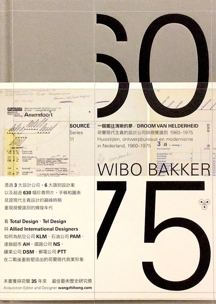
This book won the award for the best art historical research in the Netherlands in the past 35 years
Through 3 major design companies. 6 major identity design cases
and more than 630 rare photographs, manuscripts and diagrams
Witness the pinnacle of modernist design
Bringing back the glory days of visual identity
See Total Design, Tel Design, Allied International Designers
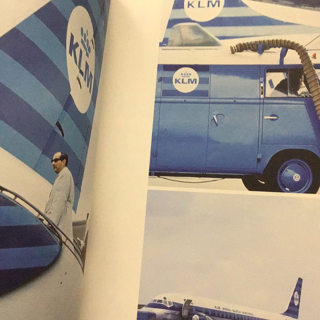
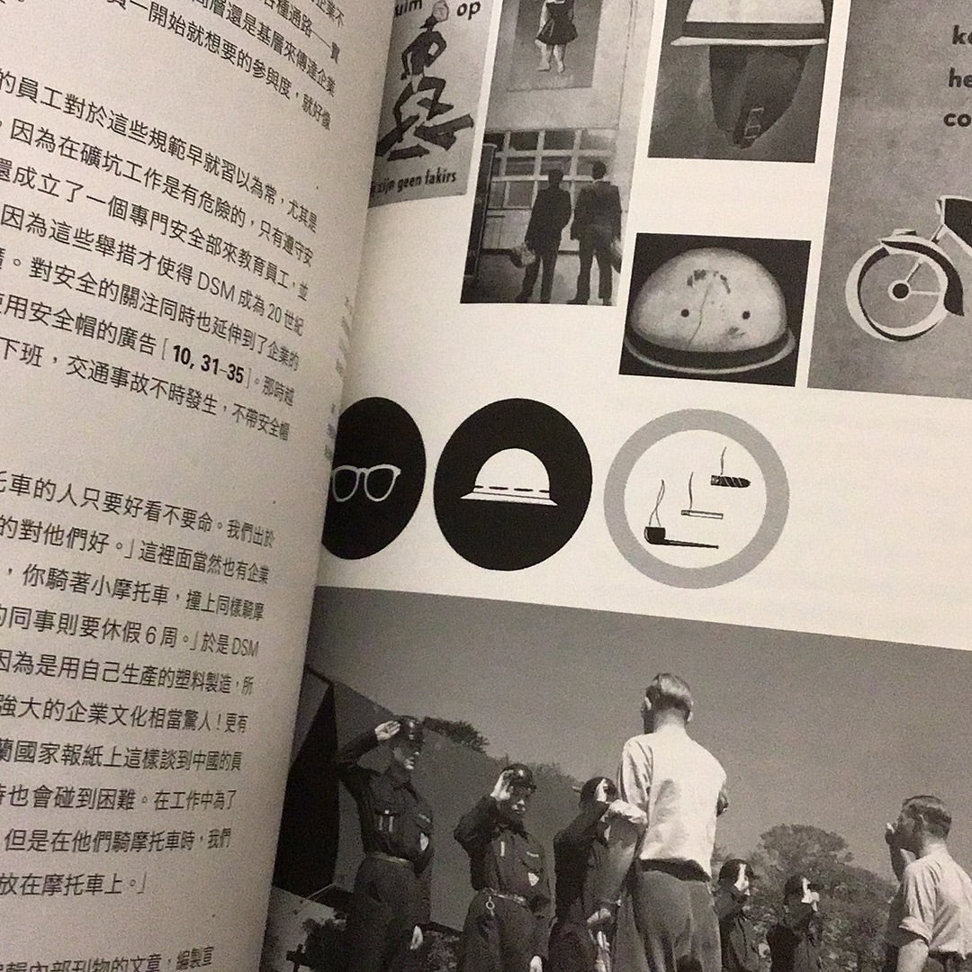
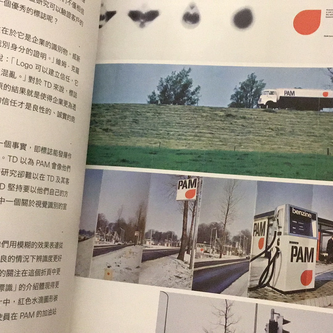
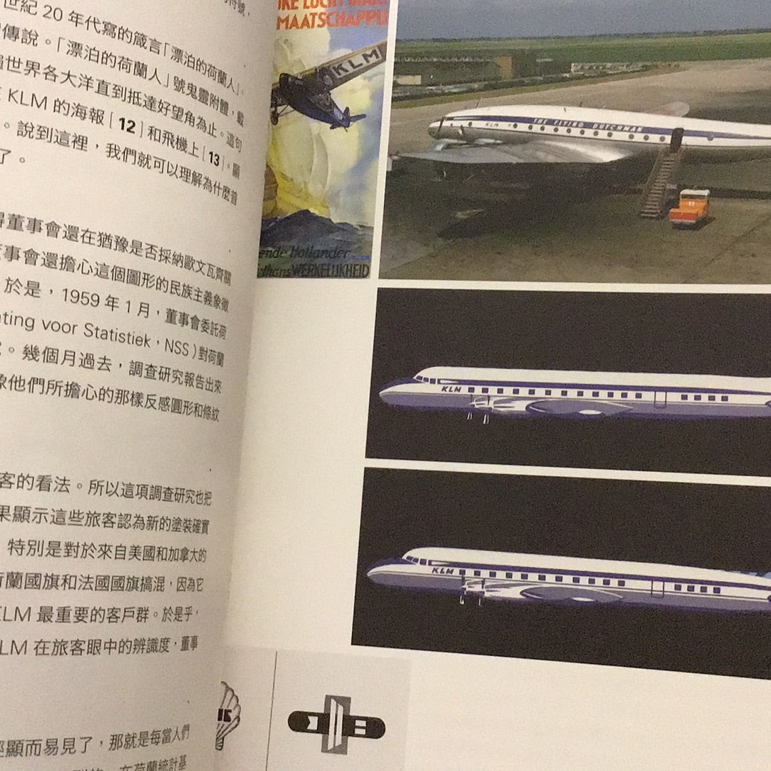
How to provide services for airline KLM, oil company PAM, supermarket chain AH, railway company NS, mining company DSM, postal and telecommunications company PTT
Recasting a favorable modern business image of the Netherlands after World War II?
After the Second World War, the Netherlands was left with a lot to do. After more than ten years of reconstruction, it became a modern industrial country. In 1960, the economy tended to stabilize and develop, and a huge social energy was brewing, which not only promoted large-scale construction projects in the country, but also prompted large enterprises to transform and introduce visual recognition.
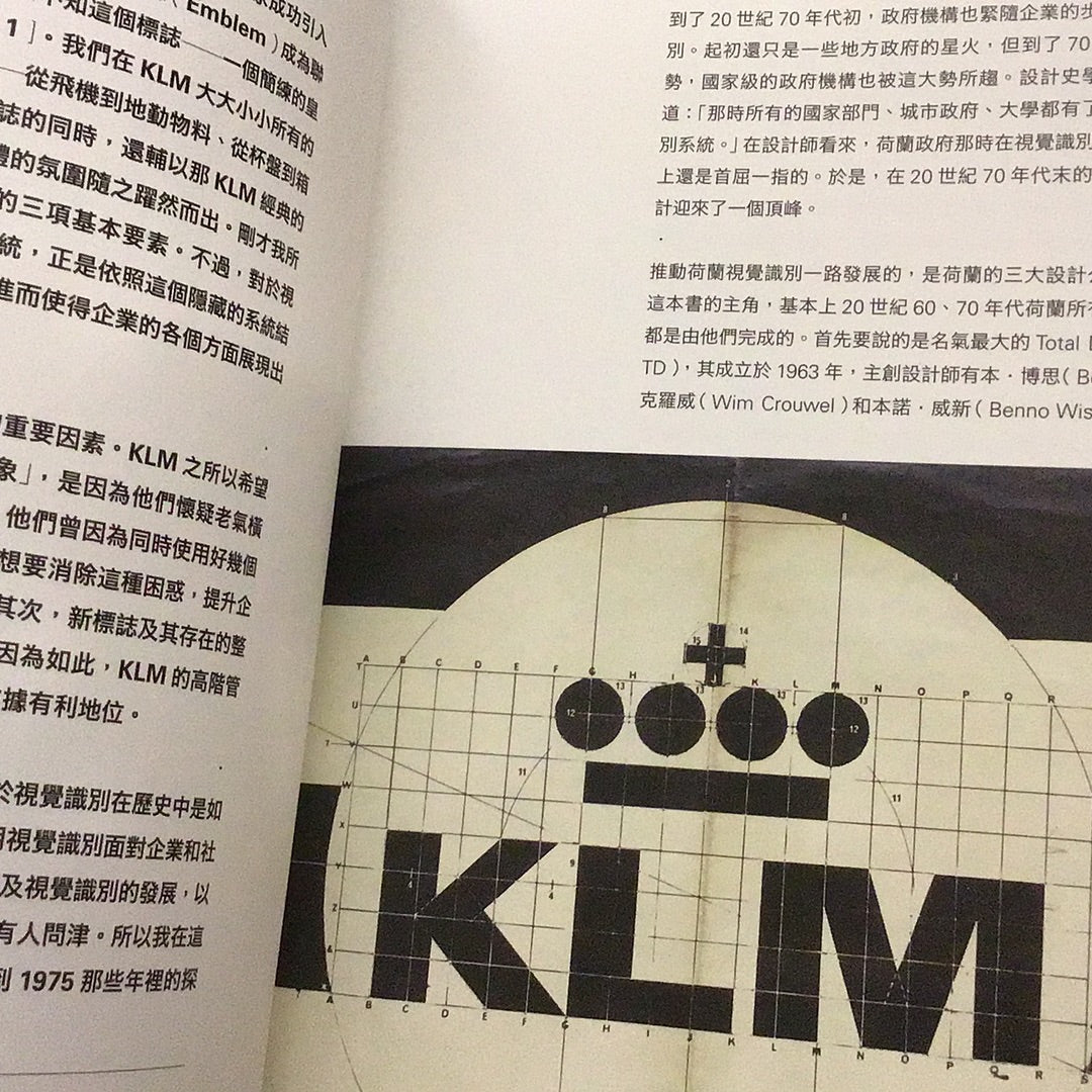
As early as the 1950s, companies with modern visual identity appeared in the United Kingdom and the United States. In the Netherlands, it was not until 1963 that Royal Airline KLM became the first company in history to successfully introduce visual identity. The oil company PAM, the supermarket chain AH, and the railway company NS, the mining company DSM, etc., only had modern visual identity systems in the late 1960s.
In the 1970s, this trend also spread to government agencies. Design historian Kees Broos once wrote in an article: "At that time, all national departments, city governments, and universities had their own logos and identification systems." The Dutch government's initiative The investment is second to none in the world and has led the Dutch visual identity design to unprecedented heights.
Promoting the development of Dutch visual identity along the way are the three world-renowned design companies. The most famous is Total Design, which was founded in 1963 by Ben Bos, Wim Crouwel and Ben It is led by three major designers: Benno Wissing, whose rigorous modernist design style is highly praised by peers. Next is Tel Design, which was founded in 1962 and did not emerge until the late 1960s. Although it started later than TD, under the leadership of creative director Gert Dumbar, it is indistinguishable from TD. The other team is Allied International Designers from the United Kingdom. Director James Pilditch advocates running the company on a commercial basis. It can be called the most successful foreign design company from the 1960s to the 1980s.
In the eyes of designers, visual identity is an excellent design that generates positive energy and high quality for the entire society. They also have a certain idealistic complex towards visual identity design - a "clear dream" that can be used to improve Effectiveness of communication and the efficiency and order with which social functions function. The designer hopes to clearly express the structure of the company through visual identity and allow the company to operate more efficiently. They use modernist techniques to promote effective visual communication, thereby benefiting the entire society; they integrate modernist aesthetics and methods into design, and regard the "pursuit of clarity" as a "dream" that can benefit everyone.
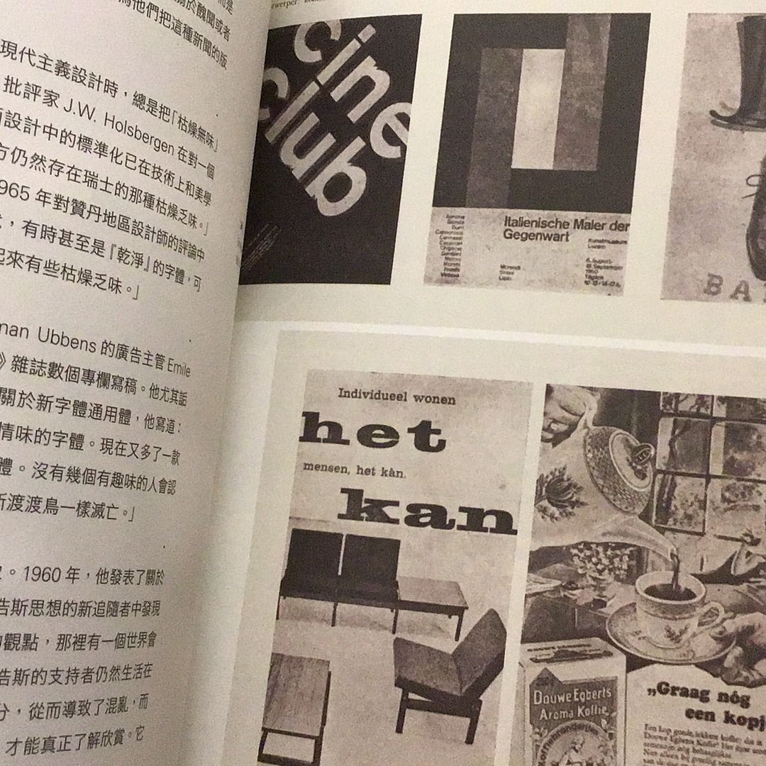
At that time, influenced by the Swiss International Design School, Dutch designers used regular, concise and clear structures to convey vision. The company's complete visual identity system used unified layout, fonts, logos and colors, and used a large number of bright colors in the design. , geometric shapes, and sans-serif fonts have also become the best footnotes of that era.
In the 1970s, the economic depression caused the visual recognition business to shrink, and Dutch society also experienced tremendous social changes. Young people rebelled against government authority, and the public became hostile to business. In response to social calls, the design community also launched a critique of modernism. This caused tensions within the two companies, TD and Tel. On the one hand, they have to reconnect their design attitudes with the spirit of the times; on the other hand, they have to struggle to survive the economic recession spreading across the Western world. In particular, the TD led by Wim Crowe came under attack. Under the leadership of Dembe, Tel has begun to turn to postmodernism.
The modernist art and design of the Netherlands in the 20th century has left us a valuable legacy. Dutch graphic design is an important force in the world of graphic design. Its modernist design has spawned a large number of outstanding designers and design institutions. However, little is known about the development of modernism before it, especially the dynamic relationship between design and social, economic, political and other cultural backgrounds.
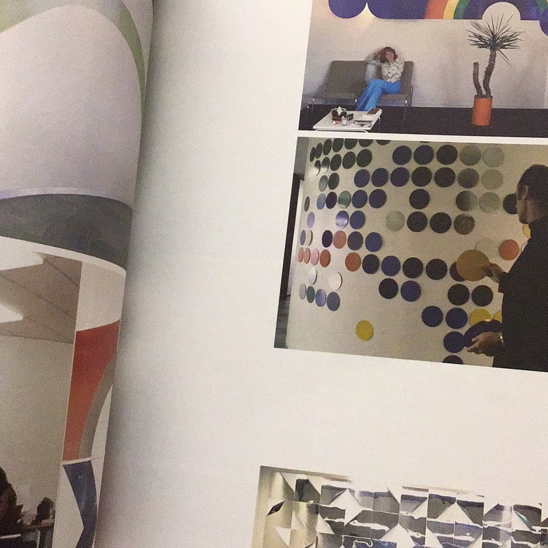
This book comprehensively examines the designers (such as design companies, freelance designers), clients (such as enterprises, governments, public institutions), and executors (such as printing houses, executive producers) of visual identity in the socio-economic environment of the Netherlands from 1960 to 1975. business) and more related groups. Through more than 600 precious photos and manuscripts, the author shows readers that little-known golden age, as well as the various thoughts and practices of Dutch designers or companies when facing specific design issues.
View full details
Through 3 major design companies. 6 major identity design cases
and more than 630 rare photographs, manuscripts and diagrams
Witness the pinnacle of modernist design
Bringing back the glory days of visual identity
See Total Design, Tel Design, Allied International Designers
How to provide services for airline KLM, oil company PAM, supermarket chain AH, railway company NS, mining company DSM, postal and telecommunications company PTT
Recasting a favorable modern business image of the Netherlands after World War II?
After the Second World War, the Netherlands was left with a lot to do. After more than ten years of reconstruction, it became a modern industrial country. In 1960, the economy tended to stabilize and develop, and a huge social energy was brewing, which not only promoted large-scale construction projects in the country, but also prompted large enterprises to transform and introduce visual recognition.
As early as the 1950s, companies with modern visual identity appeared in the United Kingdom and the United States. In the Netherlands, it was not until 1963 that Royal Airline KLM became the first company in history to successfully introduce visual identity. The oil company PAM, the supermarket chain AH, and the railway company NS, the mining company DSM, etc., only had modern visual identity systems in the late 1960s.
In the 1970s, this trend also spread to government agencies. Design historian Kees Broos once wrote in an article: "At that time, all national departments, city governments, and universities had their own logos and identification systems." The Dutch government's initiative The investment is second to none in the world and has led the Dutch visual identity design to unprecedented heights.
Promoting the development of Dutch visual identity along the way are the three world-renowned design companies. The most famous is Total Design, which was founded in 1963 by Ben Bos, Wim Crouwel and Ben It is led by three major designers: Benno Wissing, whose rigorous modernist design style is highly praised by peers. Next is Tel Design, which was founded in 1962 and did not emerge until the late 1960s. Although it started later than TD, under the leadership of creative director Gert Dumbar, it is indistinguishable from TD. The other team is Allied International Designers from the United Kingdom. Director James Pilditch advocates running the company on a commercial basis. It can be called the most successful foreign design company from the 1960s to the 1980s.
In the eyes of designers, visual identity is an excellent design that generates positive energy and high quality for the entire society. They also have a certain idealistic complex towards visual identity design - a "clear dream" that can be used to improve Effectiveness of communication and the efficiency and order with which social functions function. The designer hopes to clearly express the structure of the company through visual identity and allow the company to operate more efficiently. They use modernist techniques to promote effective visual communication, thereby benefiting the entire society; they integrate modernist aesthetics and methods into design, and regard the "pursuit of clarity" as a "dream" that can benefit everyone.
At that time, influenced by the Swiss International Design School, Dutch designers used regular, concise and clear structures to convey vision. The company's complete visual identity system used unified layout, fonts, logos and colors, and used a large number of bright colors in the design. , geometric shapes, and sans-serif fonts have also become the best footnotes of that era.
In the 1970s, the economic depression caused the visual recognition business to shrink, and Dutch society also experienced tremendous social changes. Young people rebelled against government authority, and the public became hostile to business. In response to social calls, the design community also launched a critique of modernism. This caused tensions within the two companies, TD and Tel. On the one hand, they have to reconnect their design attitudes with the spirit of the times; on the other hand, they have to struggle to survive the economic recession spreading across the Western world. In particular, the TD led by Wim Crowe came under attack. Under the leadership of Dembe, Tel has begun to turn to postmodernism.
The modernist art and design of the Netherlands in the 20th century has left us a valuable legacy. Dutch graphic design is an important force in the world of graphic design. Its modernist design has spawned a large number of outstanding designers and design institutions. However, little is known about the development of modernism before it, especially the dynamic relationship between design and social, economic, political and other cultural backgrounds.
This book comprehensively examines the designers (such as design companies, freelance designers), clients (such as enterprises, governments, public institutions), and executors (such as printing houses, executive producers) of visual identity in the socio-economic environment of the Netherlands from 1960 to 1975. business) and more related groups. Through more than 600 precious photos and manuscripts, the author shows readers that little-known golden age, as well as the various thoughts and practices of Dutch designers or companies when facing specific design issues.
